
MealPrepPro is a meal-planning app designed to simplify healthy eating by generating customised weekly meal plans. Its intelligent algorithm considers calorie targets, activity levels, allergies, and food preferences to create optimised plans, making meal prep effortless.
To enhance user engagement and reinforce the intelligence behind its meal-planning process, MealPrepPro sought to improve two key areas of the user journey:
MealPrepPro’s core value proposition lies in its ability to generate tailored meal plans based on a wide range of user preferences. However, two key challenges were identified:
The goal was to design engaging UI elements and an animation that visually reinforced the intelligent algorithm behind the meal planner while also streamlining the review experience to improve user retention.
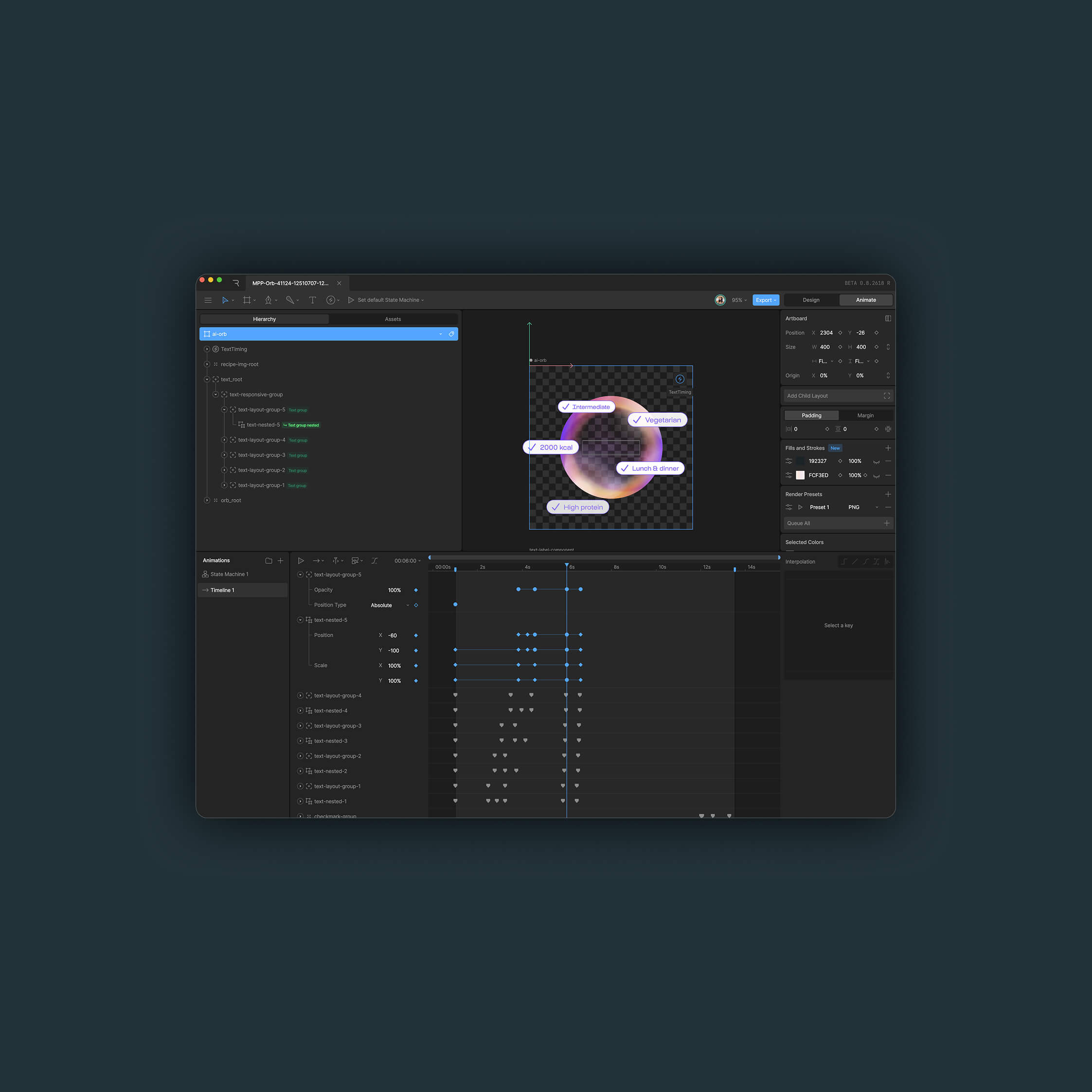
Animated orb
Different visual styles for the animation were explored, including AI-inspired glowing elements, spinning flows, and floating bubbles. Using Rive, an interactive animation was developed where a central orb pulsed and cycled through user inputs—such as flavour preferences, calorie needs, and dietary requirements, before generating a customised meal plan. Floating meal images appeared in animated bubbles, reinforcing the personalised selections and getting users excited about their upcoming menu.
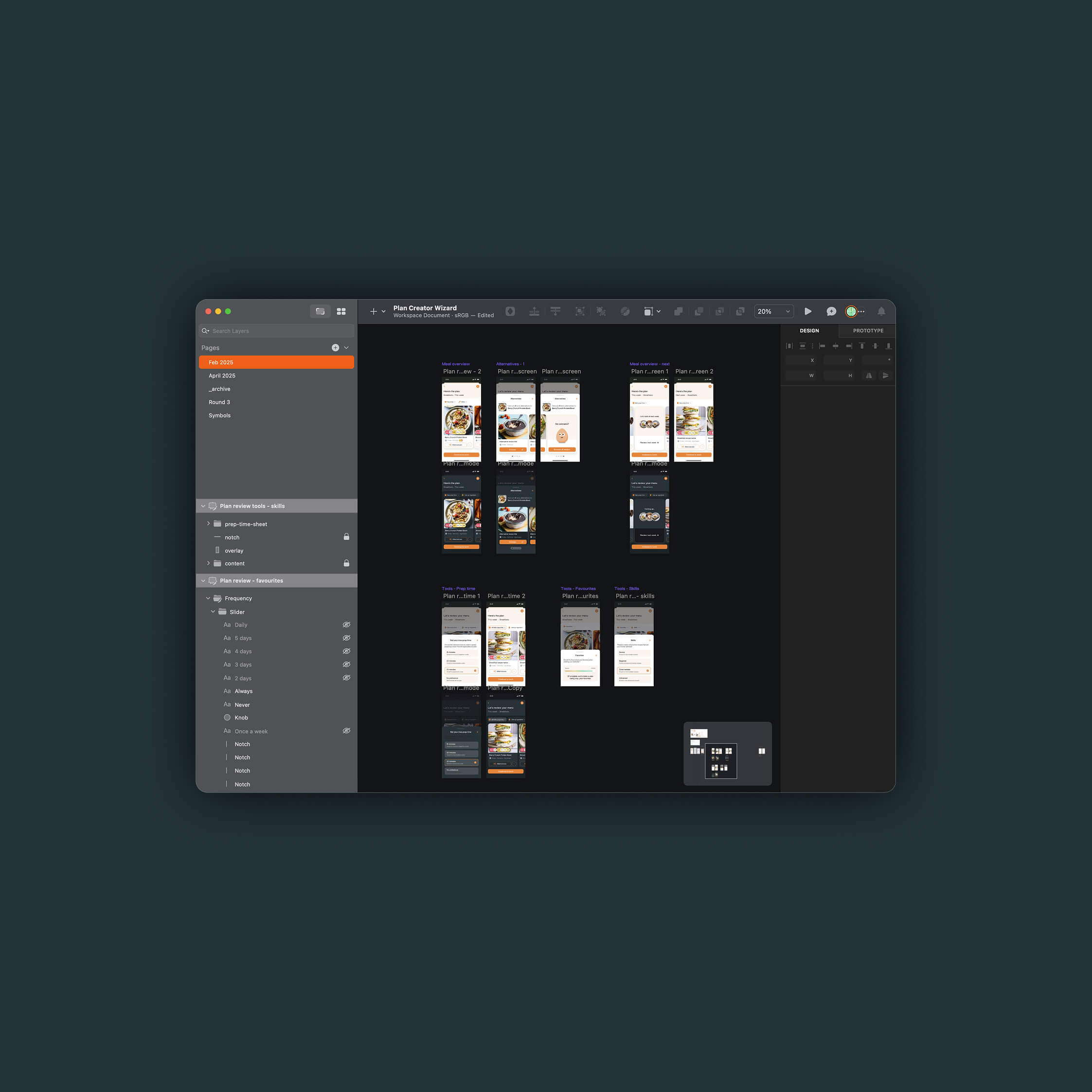
Meal planner review
The review flow was restructured to improve clarity by introducing a revised layout and clearer visual indicators, such as the 'cook & prep' UI pattern, helping users better understand how meals were planned. Expandable tool sections were added to enhance usability, including future release features such as 'Use Up an Ingredient', and 'Recipe Favourites' to prioritise or deprioritise user favourites. To refine interaction patterns, swipable cards replaced static lists, making meal comparisons more intuitive, and a "Browse All Recipes" button was introduced to provide additional flexibility. Recipe imagery was also made front and centre to encourage excitement and anticipation for users' meal prep ahead.
The final experience featured a dynamic AI-powered animation that made the meal planning process feel tangible and engaging. The review flow was streamlined with intuitive filtering tools and clearer meal repetition logic. Interaction design was improved with a swipable carousel for meal alternatives, clearer call-to-action buttons, and an optimised layout that reduced cognitive load.
Initial feedback indicates that the animated orb has helped users feel more connected to the intelligence behind their meal plan. The improved review experience has made meal customisation more intuitive, reducing confusion around meal repetition and refining workflows for finding alternatives. Engagement with the new plan review tool and feedback suggest that users appreciate having more control over their plans, as well as being served a more streamlined choice - users say that being shown just 5 alternatives (with the option to swap) feels less overwhelming than being shown the full recipe browser.
This is an ongoing project, and the team will continue to optimise and iterate on various parts of the journey through A/B testing and gathering feedback.
User feedback so far reinforced the importance of balancing animation length with engagement and ensuring the review process is both flexible and intuitive. Future iterations could explore additional interactivity within the orb animation to further personalise the meal plan generation process; more advanced filtering and customisation tools could be developed to provide greater flexibility in the review experience.